There is a specific type of post-delivery dispute that experienced procurement consultants recognize immediately, because it follows the same pattern almost every time. The bulk order arrives. Procurement signs off on delivery. The marketing team opens the boxes, holds up a custom canvas tote bag next to the brand style guide, and says: "This isn't our color." The factory, when contacted, responds with the approved sample photograph. The color in the photograph matches the delivered product. The dispute then becomes a negotiation over who bears the cost of a reprint—a negotiation that rarely ends cleanly for either party.
What makes this pattern so persistent is that neither side is wrong in the conventional sense. The factory reproduced what was approved. The marketing team is correct that the color doesn't match their brand standards. The failure happened earlier, in a gap that most procurement processes don't have a mechanism to close: the translation between digital brand specifications and physical manufacturing reality.
Brand guidelines are designed for digital and offset print contexts. When a company establishes its Pantone color standards—say, PMS 286 for a corporate navy blue—that specification is calibrated against coated paper stock, the substrate used in business cards, brochures, and packaging. The Pantone Matching System for coated paper (designated with a "C" suffix) measures how ink behaves on a smooth, non-absorbent surface where color sits on top of the substrate with minimal interference from texture or fiber structure. This is the reference point that marketing teams use when they say "our brand blue is PMS 286 C."
What those same marketing teams rarely know—and what procurement teams rarely think to verify—is that Pantone maintains an entirely separate matching system for textiles: the Pantone Fashion, Home + Interiors system, designated with "TPX" or "TPG" suffixes. These textile color standards measure how dye and ink behave on fabric, where the optical properties are fundamentally different. Fabric fibers absorb ink rather than allowing it to sit on the surface. The texture of woven or non-woven material breaks up solid color areas, creating a visual effect that differs from the smooth, uniform appearance of paper print. The same color number in the C system and the TPX system are not the same color—they are the closest achievable equivalents across two different physical media, and the gap between them can be visually significant.
In practice, this is precisely where corporate gift selection decisions start to be misjudged. When a buyer submits artwork for a custom canvas tote bag order and specifies "PMS 286 C," the factory's screen printing department interprets this as a request for their closest available ink to that color. They are working with textile-grade inks, not paper inks, and their color matching is calibrated against textile standards. The resulting print may be technically accurate within the tolerances of fabric printing, but it will look different from the buyer's brand guidelines because those guidelines were never designed for fabric reproduction.

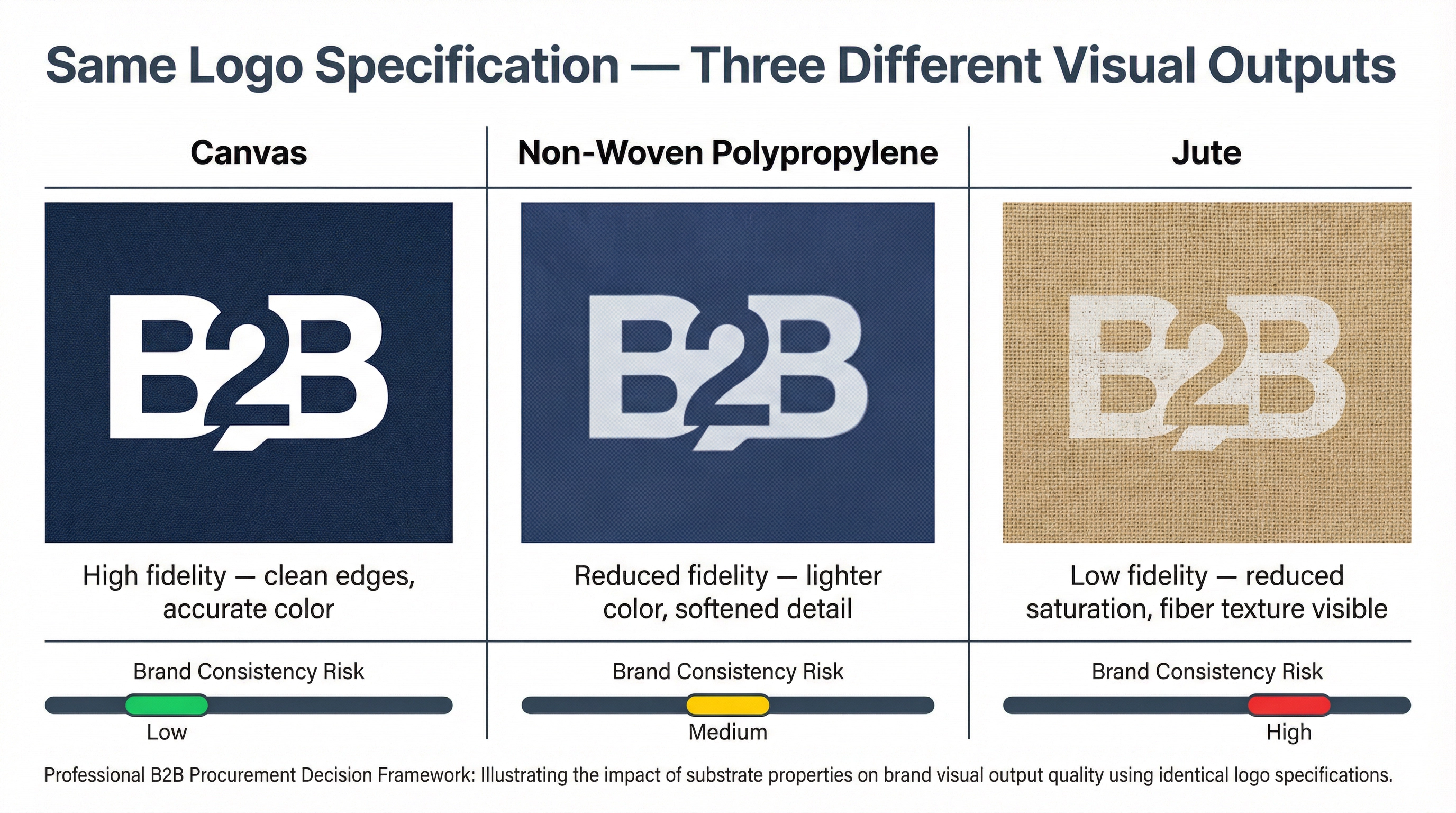
The substrate effect compounds this problem in ways that buyers rarely anticipate. Canvas, jute, and non-woven polypropylene—the three most common materials for corporate tote bags—each interact with printing ink differently. Canvas, being a natural fiber with visible texture, absorbs ink into the weave and creates a slightly muted, organic appearance even with high-quality screen printing. The texture of the weave is visible through solid color areas, which reduces the perceived saturation compared to the same color on smooth paper. Jute, with its coarser fiber structure, produces an even more pronounced texture effect and is typically printed with a lighter hand to prevent ink cracking. Non-woven polypropylene, while smoother than natural fibers, has a slightly translucent quality that affects how colors appear against the white or off-white base material.
None of these substrate effects are defects. They are inherent properties of the materials, and experienced suppliers account for them in their production processes. The problem is that buyers who have never seen their brand colors reproduced on these materials have no reference point for what "correct" looks like on fabric. They approve samples based on their paper-calibrated expectations, and the discrepancy only becomes apparent when the bulk order is placed next to a printed business card or brand guideline document.
The organizational gap that allows this problem to persist is worth examining carefully. In most corporate procurement processes, the person who approves the production sample is not the same person who evaluates brand compliance. Procurement teams are responsible for specification accuracy, lead time, and cost management. They assess whether the sample matches the approved artwork file and whether the construction meets the specified requirements. Brand and marketing teams are responsible for visual consistency across all touchpoints. They assess whether the delivered product looks correct against the brand system. These two evaluations happen at different stages of the procurement process, and they use different reference points.
When procurement approves a sample, they are typically comparing the physical sample against the digital artwork file on a computer screen. Computer monitors display color in RGB, which has a broader gamut than any physical printing process. A color that appears rich and saturated on screen will always look somewhat different in print, and the gap is larger for fabric printing than for paper printing. When marketing evaluates the bulk delivery, they are comparing the physical product against other physical brand materials—business cards, packaging, signage—that were produced through offset printing on coated paper. The comparison is between two different physical substrates, and the difference in appearance is not a production error; it is a material reality that was never addressed in the specification process.
The financial consequences of this gap are rarely small. A reprint of 1,000 custom canvas tote bags at standard B2B pricing represents a significant unbudgeted cost. More importantly, reprints require the full production lead time—typically four to six weeks—which means that if the original order was placed with adequate lead time for an event, the reprint will almost certainly arrive too late. The buyer then faces a choice between using the "off-brand" bags for the event or proceeding without branded merchandise. Neither outcome is acceptable, and both represent a failure that was preventable at the specification stage.
The correction requires a change in how color specifications are communicated to suppliers, not a change in brand guidelines. When ordering fabric-based corporate gifts—canvas tote bags, jute bags, non-woven bags, or any textile product—the specification should reference Pantone TPX or TPG codes rather than Pantone C codes. If the buyer's brand guidelines only specify Pantone C codes, the procurement team should request a textile color match from the supplier before sample production begins. This is a standard service that experienced fabric printing suppliers provide: they will identify the closest TPX equivalent to the specified C code and confirm the expected visual difference before committing to production.
Sample evaluation should also involve the brand or marketing team, not just procurement. This sounds obvious, but in practice it requires a deliberate process change. Sample review timelines need to account for the additional stakeholder, and the review should include a comparison of the physical sample against other brand materials under multiple lighting conditions—not just under office fluorescent lighting. Colors behave differently under natural daylight, incandescent light, and LED lighting, and a sample that looks acceptable under one lighting condition may look noticeably different under another. Corporate gifts are used in a wide range of environments, and the brand impression they create depends on how they look across those environments.
The broader principle connects to something that experienced procurement consultants observe repeatedly in corporate gifting projects: the decision about which type of gift to select—and how to brand it—cannot be made purely on the basis of cost, category, or recipient tier. The physical properties of the gift material determine what branding is achievable, and those constraints need to be understood before the selection decision is finalized. A canvas tote bag is an excellent choice for many corporate gifting scenarios, offering durability, sustainability credentials, and a generous print area for brand expression. But the brand expression it delivers is inherently different from what a coated paper box or a printed card delivers, and that difference needs to be factored into the selection decision. When procurement teams are evaluating which types of corporate gifts best serve a particular business objective, the question of how each gift type will represent the brand under real-world conditions is as important as the question of cost or recipient preference.
The gap between digital brand standards and physical manufacturing reality is not a supplier problem. It is a specification problem, and it belongs to the buyer. Suppliers can only reproduce what they are given, within the constraints of the materials and processes they work with. The buyer's responsibility is to understand those constraints well enough to write specifications that produce the intended outcome—not specifications that assume the factory can override the laws of physics to match a paper-calibrated color standard on a woven fabric substrate.