When procurement teams build a corporate gifting portfolio across multiple business scenarios — premium canvas totes for key account appreciation, non-woven bags for trade show distribution, jute bags for sustainability-focused messaging — the selection logic is typically scenario-driven. Each material is chosen because it fits the context: canvas signals quality and durability, non-woven enables cost-efficient volume, jute communicates environmental commitment. The brand consistency assumption embedded in this approach is that as long as the same logo file and the same Pantone color specification are applied across all three materials, the resulting gifts will project a coherent brand identity regardless of which scenario they appear in. This assumption is structurally incorrect, and the gap it creates is rarely visible until the bags from different programs are placed side by side.
The mechanism behind this gap is not a production error — it is a material science reality that most procurement frameworks do not account for. Screen printing on canvas, heat transfer on non-woven polypropylene, and screen printing on jute are three fundamentally different surface interaction processes. Canvas is a woven cotton fabric with a relatively smooth, consistent surface that accepts ink with high fidelity. The same Pantone 2935C specification on canvas will produce a color that closely matches the reference standard, with clean edges and consistent opacity across the print area. Non-woven polypropylene has a fibrous, slightly textured surface that interacts with heat transfer differently — colors tend to appear slightly lighter, fine details in logos can lose definition at the fiber intersections, and the overall print has a different tactile quality than the same design on canvas. Jute presents the most significant challenge: its open weave structure means that ink partially absorbs into the fiber gaps rather than sitting on the surface, which reduces color saturation, softens edges, and creates a visual texture that is inherent to the material rather than a function of the printing process.
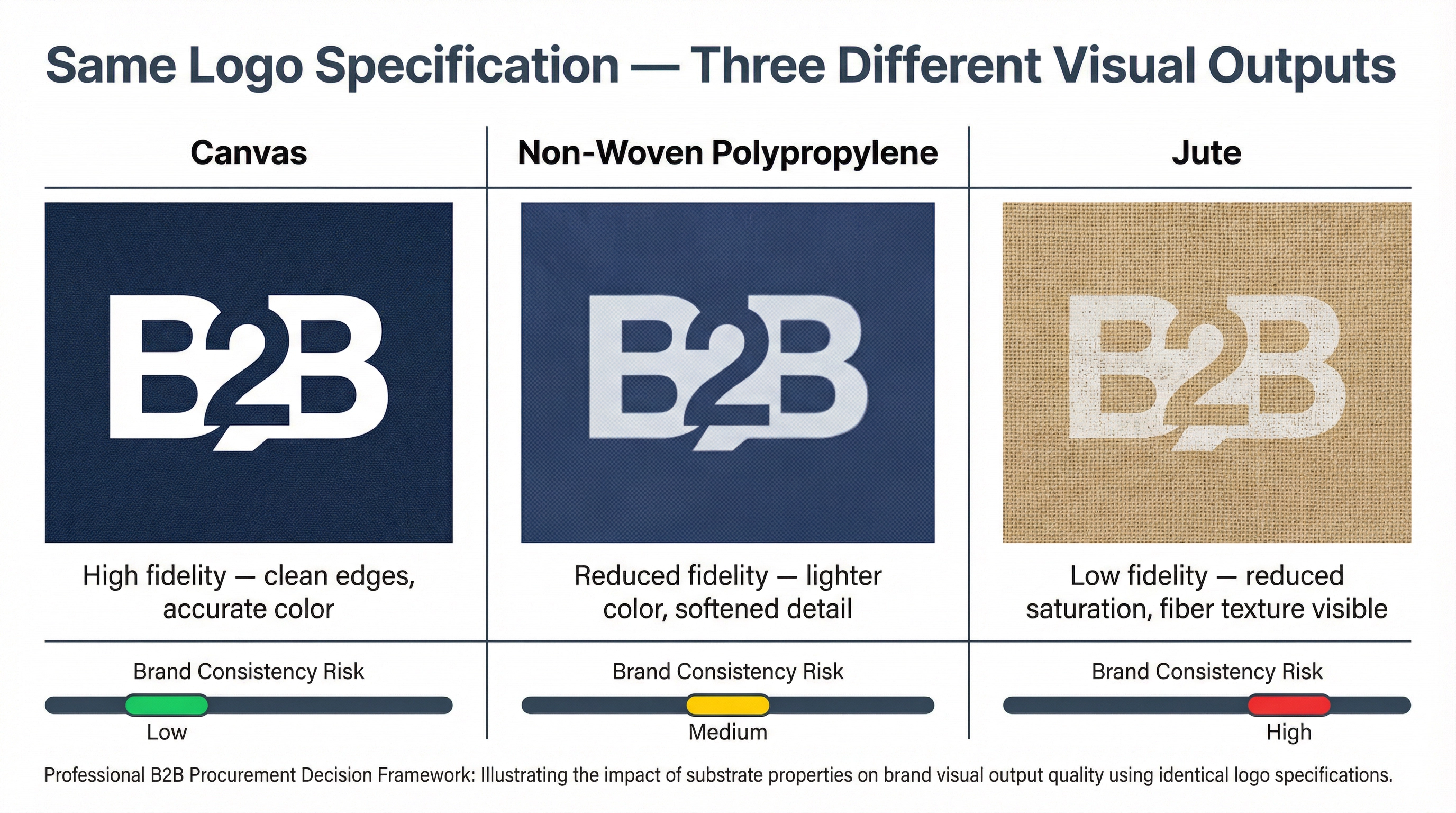
In practice, this is where corporate gift selection decisions across multiple business scenarios start to produce brand consistency problems that are difficult to attribute to any single decision. The procurement team has done everything correctly by their own framework: they specified the correct Pantone code, they approved samples for each material, and each individual bag looks acceptable on its own. The problem surfaces when a key account client who received a premium canvas tote at last year's appreciation event attends a trade show where the same company is distributing non-woven bags. The logo is the same, the color specification is the same, but the visual impression is noticeably different — the non-woven version looks lighter, slightly less precise, and carries a different quality signal. The client has not been given a lower-quality product by any objective measure, but the visual inconsistency creates a perception gap that undermines the brand coherence the gifting program was designed to reinforce.
The sample approval process does not reliably catch this problem because it evaluates each material in isolation. When the procurement team approves the canvas tote sample, they are assessing whether that specific bag meets quality standards. When they approve the non-woven bag sample, they are making the same assessment for that bag. Neither approval involves placing the two bags side by side and evaluating whether they project a consistent brand identity. This is a structural gap in how most procurement teams manage multi-material gifting portfolios: the approval process is product-centric rather than portfolio-centric, and the brand consistency question — do these bags collectively reinforce the same visual identity? — is never formally asked.
The problem is compounded when different business scenarios are managed by different internal stakeholders. The marketing team selects the premium canvas tote for client appreciation events. The events team selects the non-woven bag for trade show distribution. The HR team selects the jute bag for employee sustainability initiatives. Each team makes a reasonable selection for their specific context, and each team approves their sample independently. No single stakeholder has visibility into the full portfolio, and no approval process evaluates the three bags as a coordinated brand expression. The result is a gifting portfolio that is internally coherent by scenario but visually fragmented across scenarios — a fragmentation that becomes visible to recipients who encounter the brand in multiple contexts.
There are two practical responses to this problem, and they operate at different points in the decision process. The first is material standardization: selecting a single primary material for all corporate gifting programs and varying the product form rather than the substrate. A company that standardizes on canvas can use canvas totes for client appreciation, canvas drawstring bags for trade show distribution, and canvas pouches for employee gifts — maintaining consistent logo rendering across all scenarios while still differentiating by product type and price point. This approach eliminates the substrate rendering gap entirely but constrains the material-based messaging that some scenarios are designed to deliver. The second response is specification adjustment: rather than applying the same logo specification across all materials, developing substrate-specific artwork adjustments that compensate for each material's rendering characteristics. This means accepting that the Pantone specification will need to be adjusted for jute to achieve a result that reads as visually equivalent to the canvas version, and that fine logo details may need to be simplified for non-woven to maintain edge clarity. This approach preserves material variety but requires more sophisticated artwork management and a procurement process that explicitly evaluates cross-material visual consistency rather than treating each material as an independent specification.
The framework for matching gift types to business needs correctly identifies material selection as a scenario-driven decision. But the brand consistency dimension of that decision — how the chosen material will render the company's visual identity relative to other materials in the portfolio — requires a separate evaluation that most procurement frameworks do not include. Selecting the right material for the right scenario is a necessary condition for an effective gifting program. Ensuring that the selected materials collectively maintain a coherent brand identity across all scenarios is a different requirement, and one that becomes more important as the gifting portfolio expands to cover more business contexts.
What makes this gap particularly persistent is that it is invisible during the procurement process and only becomes apparent through recipient experience. A procurement team that has never placed their canvas tote, non-woven bag, and jute bag side by side under the same lighting conditions has no direct evidence that the brand consistency problem exists. The problem lives in the gap between individual product approvals and portfolio-level brand evaluation — a gap that most procurement processes are not designed to close. For organizations that use reusable bags as a primary corporate gifting vehicle across multiple business scenarios, building a cross-material visual consistency review into the procurement process is not a refinement. It is a structural requirement for ensuring that the gifting portfolio functions as a coherent brand expression rather than a collection of individually acceptable but collectively inconsistent products.